 Web-Works
Koumasis
Koumasis is an office that handles pension applications and social insurance matters: old-age, disability and survivor’s pensions, successive insurance, and checks of contributions and insured time. It gathers the documents, submits the application and follows the case, so clients save time, stress and needless trips.
- Sector
- Pension Applications Office
- Services
- Logo & corporate identity
- Year
- 2026
- Also the website
- Koumasis website
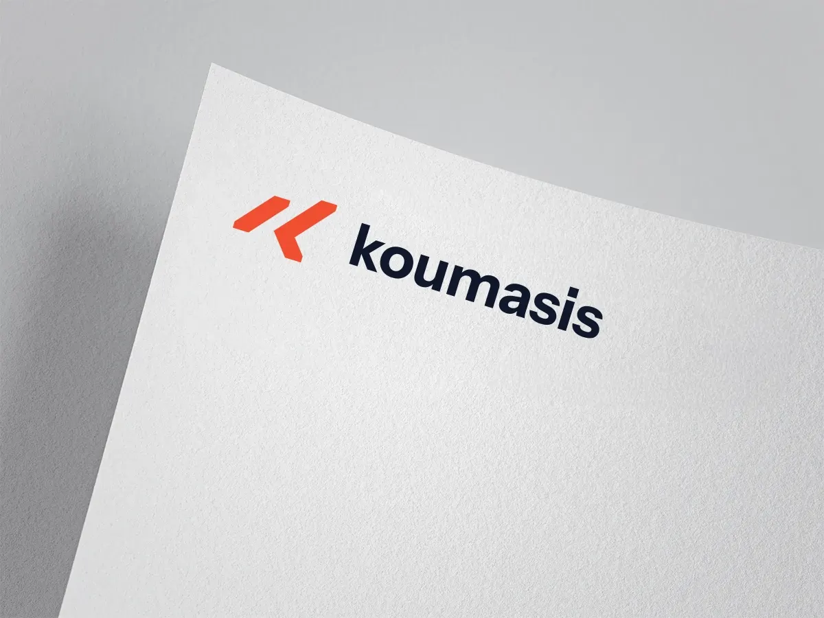
Logo Design
We designed the Koumasis logo for an office that wants to look modern and trustworthy, in a field that often feels bureaucratic and difficult.
The symbol forms a “K” from two slanted, parallel strokes that suggest forward movement: a case moving step by step towards a solution.
The final design combines:
- A symbol in bold orange that stands out and is easy to recognise
- Rounded lowercase typography in dark blue, friendly and easy to read
- Clean proportions that work in print, on the website and as an icon (favicon)
Impact
The result is a simple, warm identity that makes a technical subject feel approachable. It became the basis for the office’s website, where the orange of the symbol guides visitors to the key actions.